Why the Home page is the most important page of your website
When someone types the name of your domain (your web address), they see a special page on your website that has been designated as a Home page. Like the reception area of an office, the Home page needs to contain enough cues to reassure visitors that they're in the right place and give them guidance about how to find what they need and what to do now that they're there.
I often label this page a Welcome page because this is where someone is greeted and feels welcomed when they find your business online. A Home page also provides an important and unique function for your website. It's the only page that is connected directly to your domain name.
Planning your website navigation and defining its purpose are the first steps
Because the Home page serves such an important role for your website, the images and the text you choose for the Home page and where you place those elements on the page must support the purpose of your website and the action you want visitors to take once they're there. That's why it's important to do some planning before you create the Home page. You'll want to know how many pages you need for your website, the order in which they'll appear in the navigation, and the actions you want new and returning visitors to take to become acquainted with you and your business.
Planning the navigation
The navigation area of your website uses text links that visitors click to see the most important pages of your website. Typically people expect navigation to be shown at the top of your website and studies show that keeping the navigation links to just 5–7 options is optimal to avoid overwhelming visitors. When you're building your website, you tell the website builder which pages you want to include in the navigation. Pages that you exclude from the navigation can still be opened in other ways when you add links to them on other parts of the website through text links, image links, or buttons.
And even if you have a lot of pages, avoid nesting navigation links under each other in dropdown menus if you can possibly avoid it. It leads to tricky navigation to have to touch just the right word in a dropdown menu to open a page on a computer...and on a smartphone it's even more difficult. Instead consider consolidating information on fewer pages on your website or, if you can't do that, give smartphone visitors other ways to see important parts of your site with a secondary navigation area in the footer area at the bottom of your website or by adding clickable images or buttons that allow people to get to the pages they want to see.
The site title or logo for your website can be clicked and it always goes back to the Home page. In my experience, that action isn't common knowledge for many website visitors, so if there’s room, I like to keep the Home page as one of the visible pages in the navigation area. If there are too many links to show the Home page, I am comfortable leaving it off and letting the site title be the only way back to the Home page.
The design of your Home page forms the foundation for the rest of your website
The Home page is always the first page that is designed for a website, so many of the design decisions that will affect your whole site are made as you're designing the Home page. The large horizontal banner image on your website's Home page gives people their first impression of the message and the personality of your website and your business. A pleasing, attractive image that fits your business often influences the choice of typefaces and color accents for the website too.
The Home page for The Abbey Marblehead showcases a photo taken from the property.
In addition to choosing the banner image, you also choose the heading and body text typefaces, heading colors, button colors, and background images or colors. At this time, it's helpful to create placeholders for other pages on the site as well, if you know what they will be, so the navigation will mimic what it will look like when all pages are complete. And during this Home page design phase, you'll also design the footer area that appears at the bottom of every page. It typically takes three to four times longer to design a Home page because of the setup and design decisions you're making up front.
Your Home page must highlight important parts of your website and next steps to take
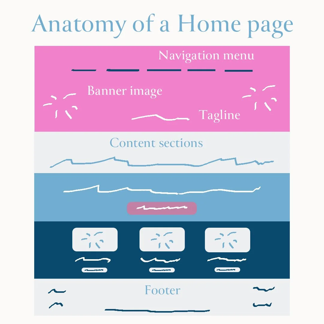
What lies between the navigation area at the top and the footer at the bottom are the contents of the Home page. The top part of the Home page must impart the most critical information: the name of your business and a slogan or introductory paragraph that tells visitors what you do and how it will benefit them. Also somewhere near the top of the Home page or even directly on the banner image, you'll add a call to action for what visitors can do to form a deeper relationship with you and your business, such as signing up for a newsletter, contacting you for a consultation, or following you on social media. Buttons stand out better than regular text as compelling calls to action.
Beneath the introductory material on the Home page, you'll put important, but less critical information, such as descriptions and links to Services, Products, or other parts of the site. You might also add testimonials, awards, or other accolades as a way to build trust with new visitors.
A Home page has a banner, tagline, call to action, content sections, and a footer
Place the most important information first to accommodate smaller screens
Websites are viewed these days on smartphones, tablets, and computers and your website needs to adjust its size accordingly. Do-it-yourself website builders like Squarespace have built-in responsive design, which means that when your website is viewed on a small screen like a smartphone, pages resize or elements move to fit the screen they're being viewed on.
On smartphones, elements are often stacked on top of each other so they are still legible. You should use the preview feature in the website builder to see what a page will look like on a smaller screen. If you place the most important information of your Home page near the top, it will appear near the top on any kind of device a person uses.
Challenges for browsing websites on a smartphone
When your website is seen on a smartphone, the navigation area may be seen as a "hamburger" icon (three lines stacked on top of each other as in the picture here) or with a single word "Menu."
To navigate to pages on your site, smartphone visitors must tap the menu and then tap the page they want to open, so it's extra work to open pages from the navigation area.
That's why alternatives like longer scrolling Home pages with links to other parts of your site can provide a more convenient way for smartphone visitors to browse through your site.
Adding content to the footer area of your website
Like the navigation, the footer area is repeated on every page. There are many ways to make this area useful. Here are some typical types of information that can be placed in a footer area:
Links to your social media accounts
Contact information: address, phone, email
Text links to additional pages that couldn't fit in the navigation area
Copyright statement and link to Privacy Policy
Photo and design credits
Examples
Here is a Home page example from a client that demonstrates some of the best practices I’ve talked about.
Nourishing Life Qigong is a healing arts practice that has individual and group sessions as well as events and classes. The first paragraph summarizes the type of services the practice offers and the first button is a call to action to schedule a session. Scrolling down the page, rows of images and service descriptions can be clicked to go to other parts of the site.
The Home page can be the most challenging page to design because you need to make a lot of design decisions up front and you must decide what is most important for visitors to know, especially new visitors. When a Home page is well-designed, it not only welcomes visitors to your website and introduces them to your business, but it also entices them to look around and stay a while. In time, the goal is that those pleasant website visits will lead to visitors becoming your loyal clients or customers.


